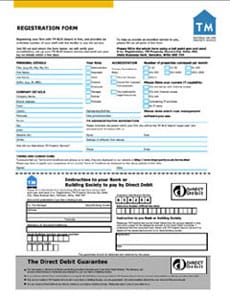
Forms
Urgh - it’s what we all think when presented with a form to complete, whether printed or online. What is it about forms that make us feel this way? Maybe, the history of being officious and complicated, a drain on our time, and they often make us feel stressed. As forms represent a business or an organisation, all these feelings are subsequently associated with that organisation - not good for customer relations or reputation!
It doesn’t have to be this way. With some time and consideration a form can have the opposite effect - admittedly, rarely a joyous occasion - but forms can be quick and easy to complete, therefore leaving the impression of an organisation who are organised and easy to deal with, building trust and enhancing brand values - great for customer relations and reputation!
Problems start when forms are forgotten or not given the attention they require. Forms are not seen as exciting or prestigious when compared to a glossy brochure, so they are often left with no owner or person responsible for them, which leads to inconsistency and confusion.
Many companies and organisations require the use of forms and questionnaires in order to communicate with customers and acquire information, making them a crucial business tool. In this instance it is important to consider the process and requirements of the document. For example:
- Are forms invalid if any there are any (even minor) completion errors?
- How will forms be used, data captured, processed and stored?
- Will various departments or organisations share the information collected?
- Has the information within a form been checked for consistency and any unnecessary repetition or overlap with other existing forms?
- Have all departments involved in collecting and processing the information checked and input to the content and consistency of the form?
- Will forms be photocopied or faxed?
If all of the above questions have not been considered, time and waste will be added within an organisation. For example:
- Added processing time for staff and the heightened risk of internal processing errors. For example, by using different terminology on screen and on paper, or by grouping and ordering information differently - all add input time and complexity.
- Dealing with returned forms containing errors, resulting in extra pressure on staff and frustrated customers.
- Technology used to process forms vs human interaction to complete. An investment in technology to process and collect data from forms requires considerations in layout, colour, and size. These factors are also important in aiding human completion accurately and with ease. If the balance is not right then there will be an increased error rate requiring manual intervention and processing, therefore adding time and cost.
- When information is to be shared electronically, ensuring that the chosen technology is compatible and well structured will save time and cost.
- By encouraging good communication with employees or departments it may be possible to reduce the number of forms required by eliminating duplication. This helps to keep customers happy and reduce cost.
How to get the best out of a form
Some good practice issues for consideration:
- Define a grid to help structure your questions and create a clear flow and sequence. Grids can also help to create zones if necessary, for example office use only or notes and guidance areas.
- Good use of typography will create a clear hierarchy and help users navigate a form. Over use of emphasis (for example, bold and italic) will become visually busy and have much less impact.
- Structured answer boxes and use of branching questions aids navigation and indicates the type of answer required. They can also prevent repetition and confusion. For example:
Could be improved by asking:
- Appropriate use of language and tone of voice can make a big difference. Avoid jargon, explain any technical words, be concise and positive rather than passive. Remember that a form is a communication, soa financial form should use a different tone of voice from holiday form!
- Any use of colour and tints should be carefully considered and tested, ensuring that there is always at least 70/30 contrast between foreground and background. Consider and test for issues such as photocopying, faxing, and legibility for colour blindness.
- Notes, guidance and instructions are only used when people are stuck (and therefore frustrated)! Placing them at the point of reference can save time and frustration as well as reduce errors. With good use of space and typography a clear difference can be made between questions, answer spaces and guidance notes, avoiding confusion and reducing errors. For example, tell people how to answer difficult questions or where to find particular information - your account number is on the top of your statement.
- Checklists can be useful to set the right expectations. For example, we will always reply to you in writing within 10 working days, remember to enclose your cheque in the envelope, return to us at the following address …
Finally…
Published research and statistics state that the completion time and error rate of a form can be greatly reduced by good design, editorial and consideration of usability. This therefore results in enhancing a customer’s experience of a brand, encouraging retention and building on reputation.
Need help?
Do you need help with your forms (both offline and online)? Get in touch to see how we can help.
Examples
Example of a form with no clear structure or flow

Example of a form with a clear structure and flow
